…are my favorite. If I could do my wedding over again I would forgo the (sort of) guaranteed late summer sunshine, pick an indoor venue and have this bridal bouquet…
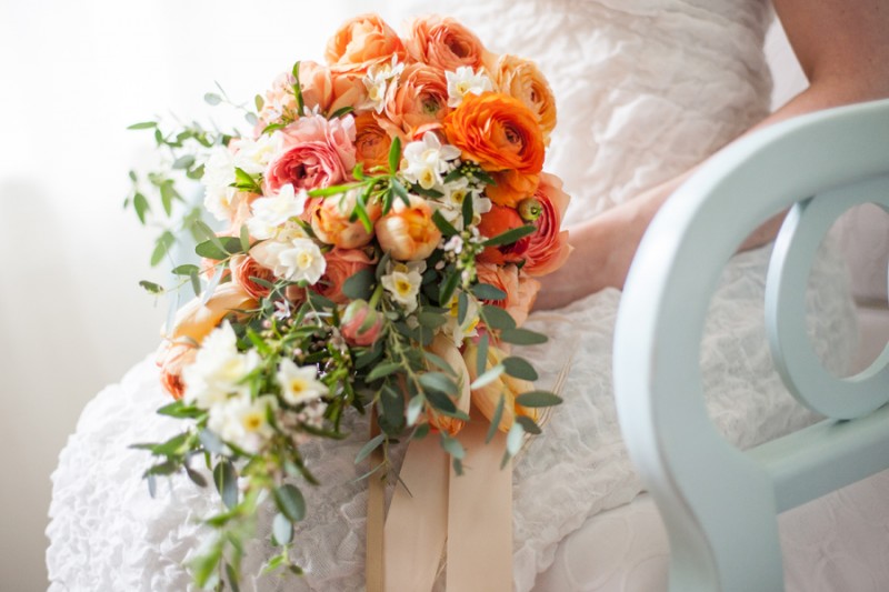 Thanks to the lovely Stephanie Cristalli for the sneak peek from today’s shoot. More to come…
- Tagged: coral, finch and thistle event design, orange bouquet, parrot tulips, peach, ranunculus, seattle event design, seattle wedding flowers, stephanie cristalli photography
- |
- Comments Off on spring weddings
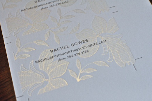
The Seattle weather may still be a little dreary but it’s definitely spring in the world of flowers and we’re celebrating the annual arrival of our floral favorites at the flower market with a new look. Over the past few months I have been collaborating with some of my favorite people on new branding, a new website, new business cards and a redesigned office! While you’ll have to wait another month or so to see the new website and images from my oh so glamorous office (think gold, elephant skin grey and blue), I’m super excited to share my gorgeous new business cards.
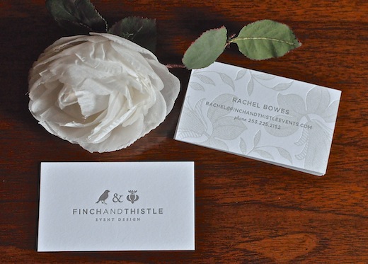
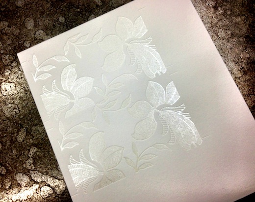
Ta da! Designed by my wonderful friend and talented designer Iwona Konarski, they are about as dreamy as can be with pearlescent foil and subtle taupe letterpress. I have been collaborating with Iwona for years and at this point she knows my style inside out. She also designed my logo all those years ago.
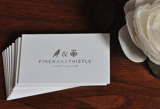
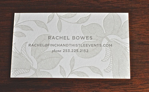
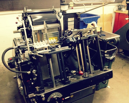
I got to accompany Iwona to Evolution Press in Ballard to watch the printing in action and make the final tweaks to the colors. The foil was printed on one press and then the cards were transferred over to another one for the letterpress. It’s very difficult to capture just how lovely the foil is with my camera but it catches the light and reflects whatever is nearby. The Evolution team did an amazing job. Can’t wait to hear what you think!
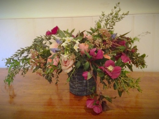
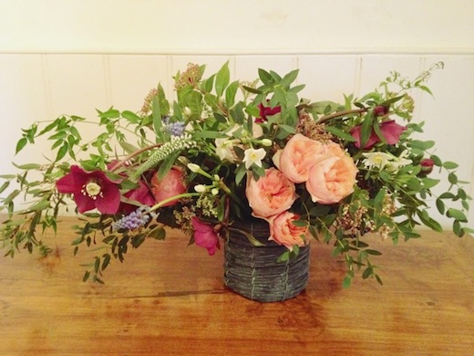
And speaking of spring, here are some flowers I did recently to celebrate the life of my grandmother. She was an accomplished floral designer herself and such an inspiration to me. I miss her every day. Thank you to everyone who posted lovely messages on our Facebook page. Your kind words meant so much. x
- { Saturday, December 29, 2012 }
New Year’s Eve Natural Tabletop Inspiration
- category: Home, Styled Inspiration Shoot
Yesterday I shared our super glam, sexy pink, gold and black holiday tabletop but perhaps you prefer the more natural, organic look? Featuring cork placemats and confetti, illustrated black and white plates, metallic linen napkins, mercury glass, metallic twine and spruce, this more rustic but still elegant look should appeal. The best part? All of the pieces are available to purchase right now online and in stores. Look for the source list after the images. Thanks again to La Happy for the stationery and adorable Christmas tree stamped cork confetti and Kate Price for the lovely images. Wishing you peace and joy for the New Year! See you in 2013.
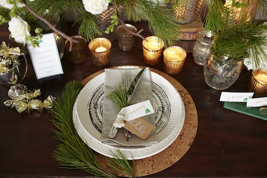
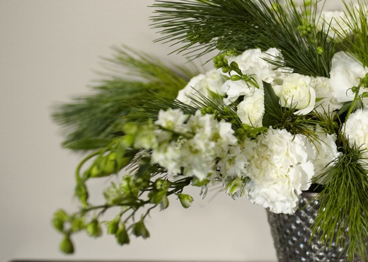
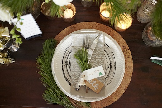
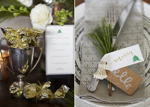
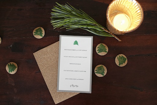
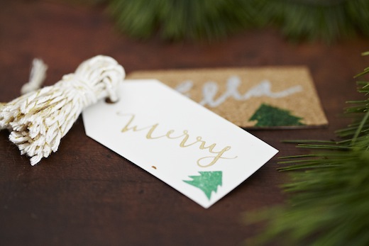
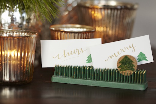
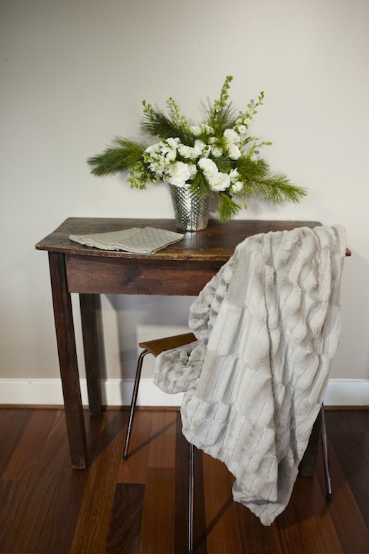 {Floral and Styling: Finch & Thistle Event Design | Photography: Kate Price Photography | Paper Goods and Calligraphy: La Happy | Metallic Napkins and Cork Placemats: West Elm | Plates: Anthopologie | Faux Fur Throw: T.J. Maxx | Vintage Flower Flog used as Escort Card Holders: Etsy/Ebay }
- { Friday, December 28, 2012 }
Published: New Year’s Eve Tabletop Inspiration
- category: Home, press, Styled Inspiration Shoot, Wedding Chicks
With New Year’s Eve fast approaching, we decided to put together a little tabletop inspiration shoot for those of you planning to celebrate at home this year. I decided on two different looks – the first, a hollywood glam look in gold, black and pink; the second, a more natural look in cork, spruce and silver. My sweet friend Sally of La Happy created the paper goods and stunning calligraphy and the lovely Kate Price took these images. Check back tomorrow for the natural tabletop look!
Look 1: Hollywood Glam in Magenta, Gold and Black
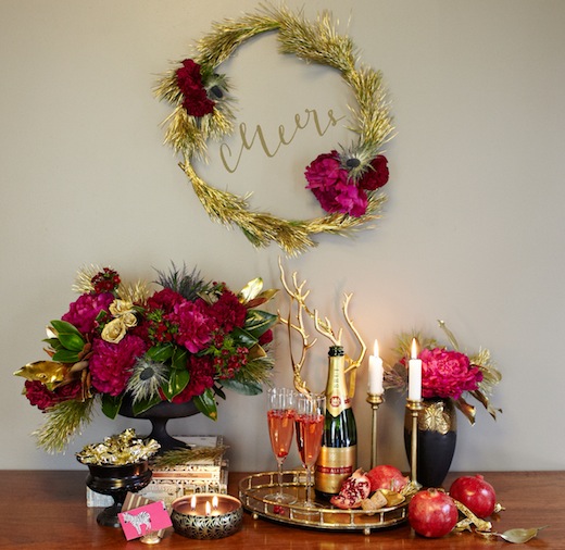
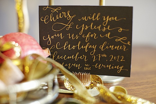
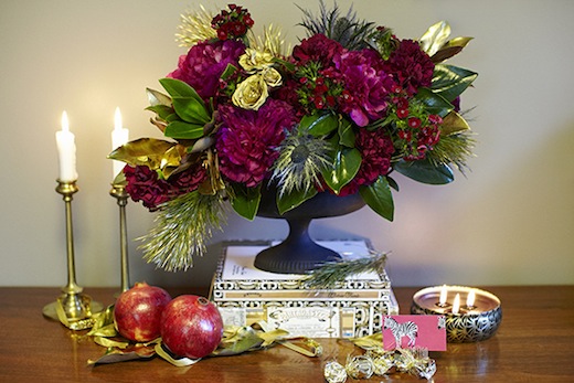
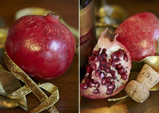
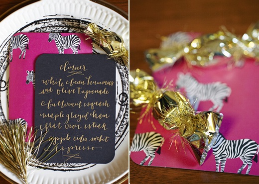
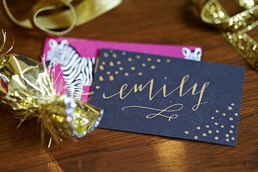
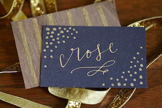
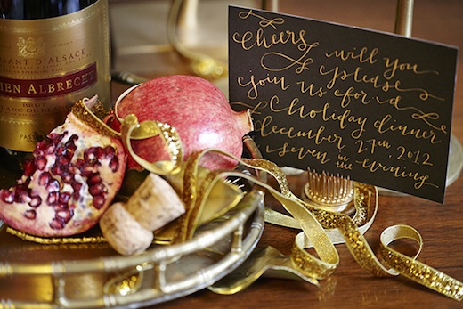
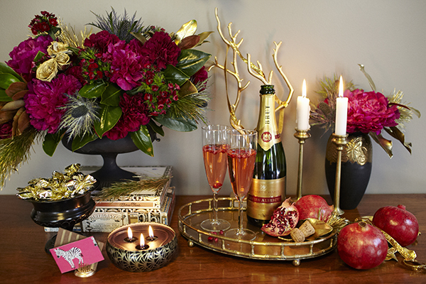
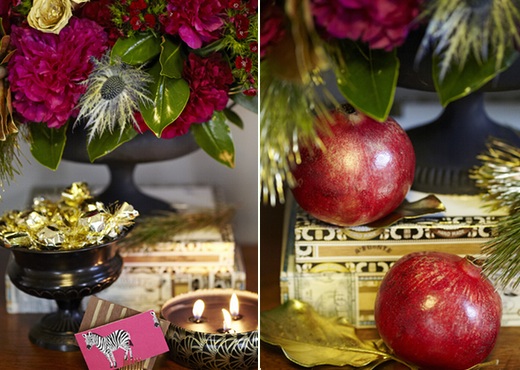
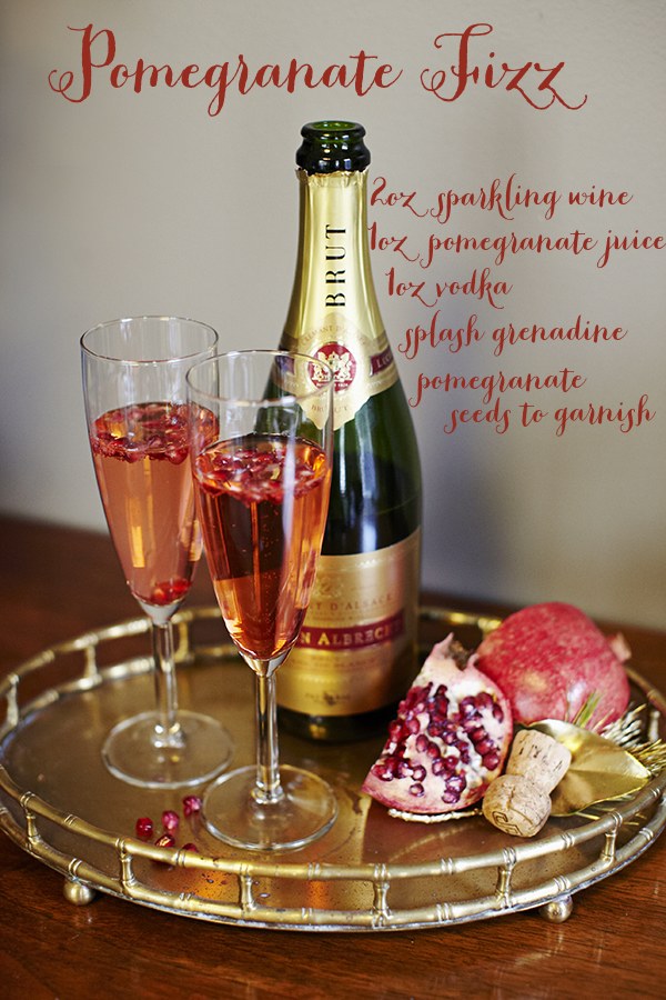
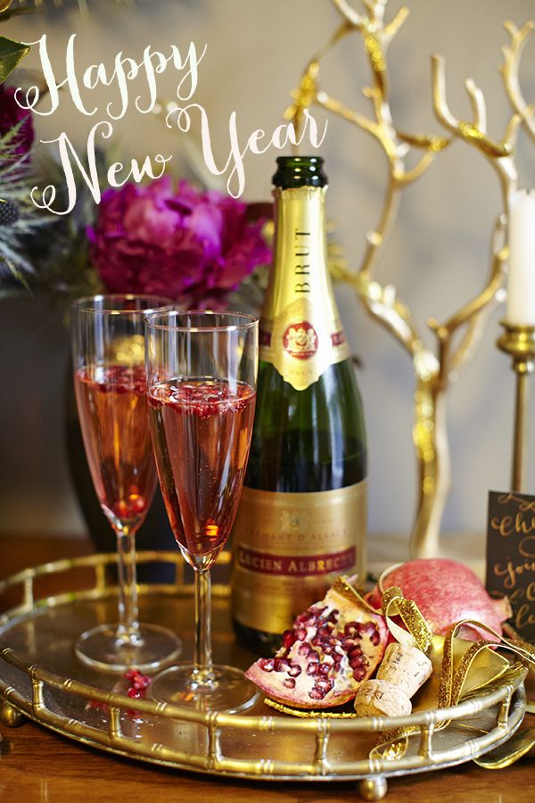
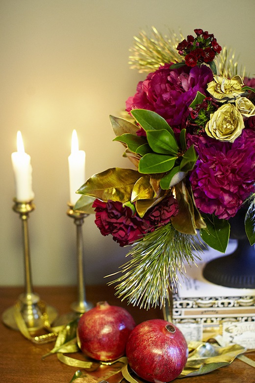 Just to make sure your party really gets going with a bang, here’s the pomegranate cocktail recipe I used…
- { Friday, December 21, 2012 }
Happy Holidays!
- category: floral design, Home, press, Styled Inspiration Shoot
 {Photography by Kate Price | Calligraphy & Paper Goods by La Happy | Floral and Styling by Finch & Thistle}
P.S. You can see more details from this fun NYE inspiration shoot on The Wedding Chicks blog today!
- Tagged: black, centerpiece, finch and thistle event design, glamorous, gold, holiday, kate price photography, lahappy, pink, tabletop
- |
- Comments Off on Happy Holidays!
- { Friday, July 15, 2011 }
Abbie and Matt – Lavender + Sage Wedding at Golden Gardens
- category: Bouquet, Boutonniere, Centerpieces, Corsage, event design, floral design, garden roses, Home, vintage decor, vintage props, Weddings
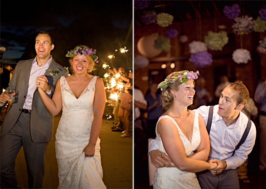
Abbie and Matt’s June wedding at Golden Gardens has to be my favorite wedding to date. Abbie was a dream client – a bride with vision on a mission to craft every element of her big day who loved every idea I dreamed up. I loved the location – Golden Garden’s Bathhouse, I loved the catering plan – Taco truck and Molly Moon’s ice cream, and I loved the high style, low budget vintage travel theme. An all around love-fest. Very fitting seeing as Abbie told me afterwards that someone told her the reception decor could be summed up in one word – “love.”
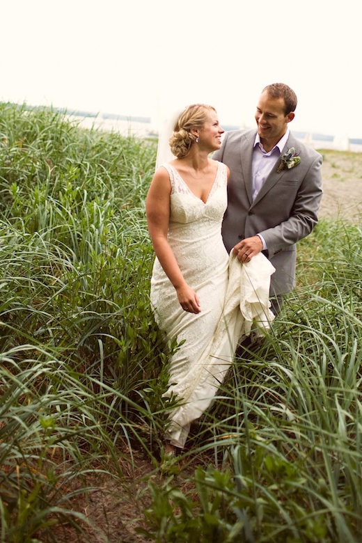
After months of planning, designing, cutting out tiny felt mustaches (Abbie), and growing (I let my catmint grow rampant in preparation for this wedding), Julie and I arrived to set up around noon and were met with bags and bags of paper pom-poms, paper place mats, shells and vintage bottles. Then I got to roam free, setting up all the prop displays and floral arrangements, hanging ribbon and pom-poms and decorating to my heart’s desire. Did I not say it was a dream wedding?
I really struggled to narrow down the images I wanted to share. I took so many pictures and then I saw the gorgeous images from Nickel Images and just went a bit wild. Definitely check out the Nickels’ blog for more details (a two part post!) of the day and some words from Abbie about her inspiration. There’s a story for every prop display…
{All images courtesy of Nickel Images unless otherwise credited}
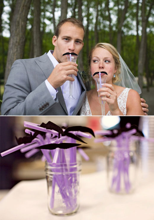
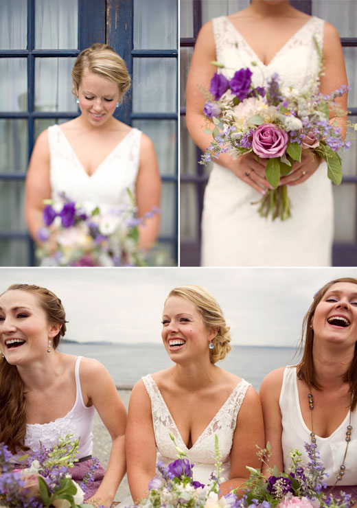
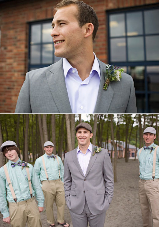
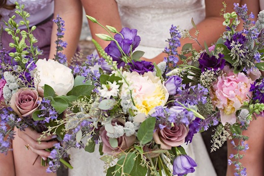
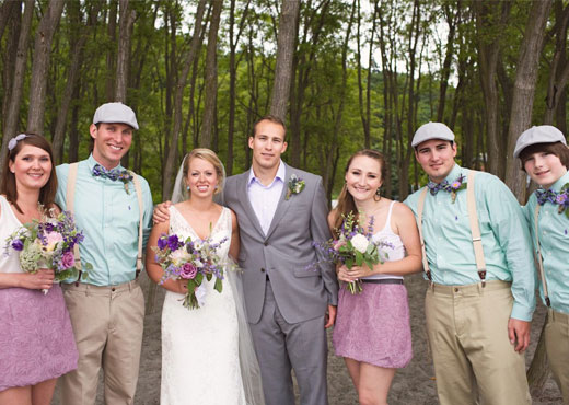
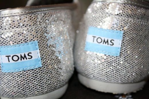
The bride and bridesmaids wore silver sparkly Toms!
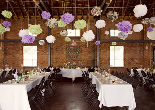
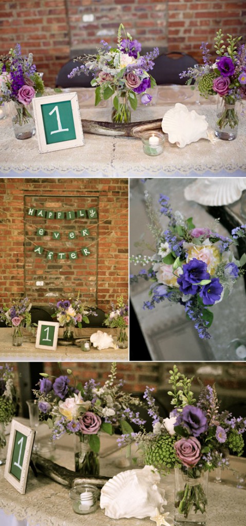
Photography: Finch & Thistle (except top image)
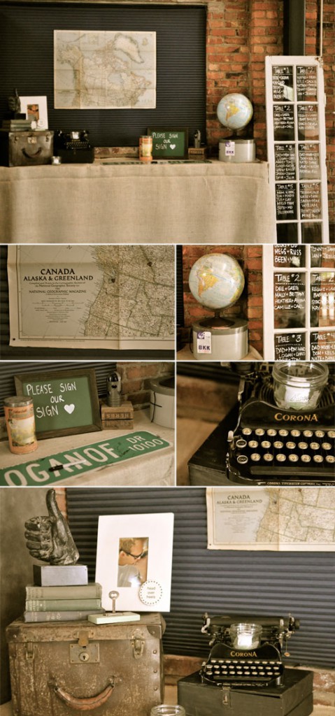
Photography: Finch & Thistle
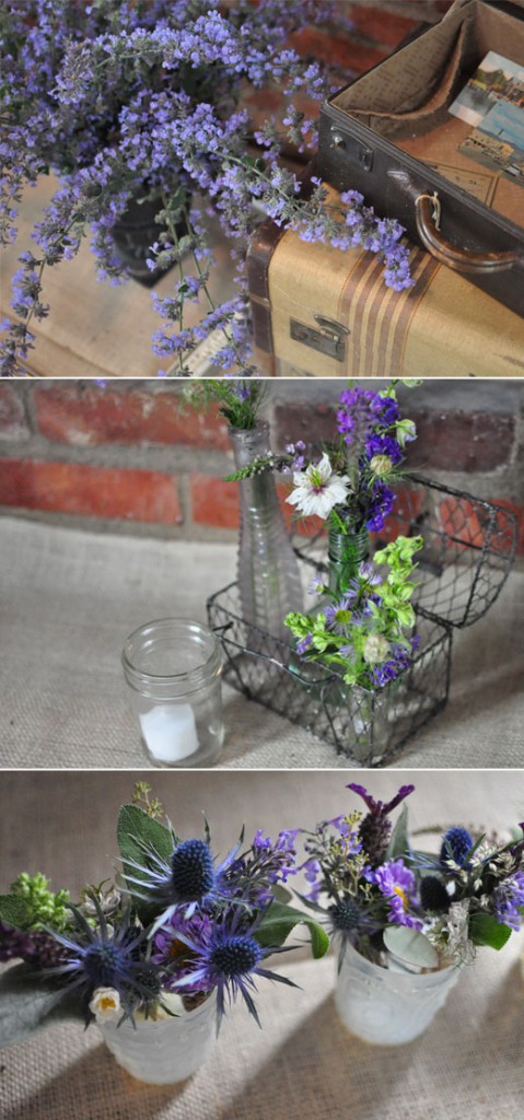
Photography: Finch & Thistle
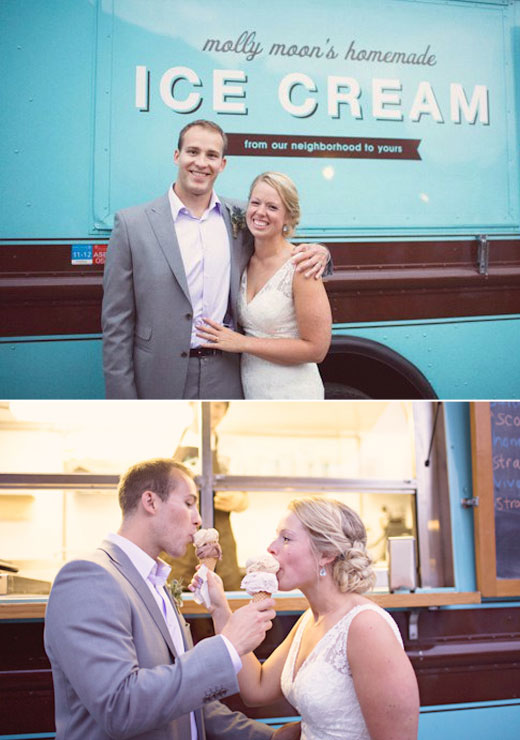
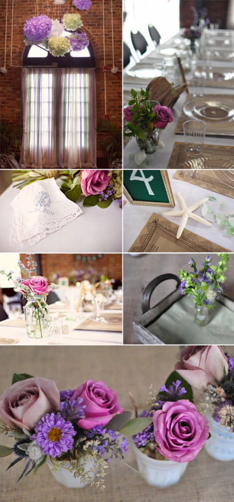
Images 2,6,7 Finch & Thistle
Previous posts
Friends
For all inquiries please contact us at
Categories
- Aisle Decor
- altar arrangements
- Bouquet
- Boutonniere
- Centerpieces
- ceremony decor
- Corsage
- Design Sponge
- Diy ideas
- E-Design Service
- event design
- floral design
- Flower School
- garden roses
- Home
- inspiration
- Modern Decor
- Once Wed
- press
- Prop styling
- Seattle Bride
- Seattle Metropolitan Bride & Groom
- Style Me Pretty
- Styled Inspiration Shoot
- vintage centerpiece
- vintage decor
- vintage props
- Wedding Chicks
- Weddings